
Cross-Chain Swaps
The swap modal enables developers to embed any-token to any-token swaps directly into their applications. Common use cases for embedded swaps include user onboarding to new wallets and serving as the canonical bridge interface for new chains.
Try out the Swap Modal here!
Component Props
| Parameter | Description | Type (see examples below) | Required |
|---|---|---|---|
apiKey | Target contract's chain ID. | ChainId | true |
wagmiConfig | Configuration for your wagmi client. | Config *imported from @wagmi/core | true |
onConnectWallet | Callback function to handle connecting wallets from the modal. | () => void | true |
chainIds | Optionally support only a subset of Decent chains. | ChainId[] | false |
className | Tailwind CSS styling. | string | false |
chainIconDictOverride | Use custom chain icons. | Record<number, any> | false |
disabled | Conditionally disable swaps. | boolean | false |
defaultDstAmount | Pre-populate the default swap value. | number | false |
hidePopularSelection | Hide the recommended popular tokens on a chain. Use with popularTokens to set custom recommeded tokens. | boolean | false |
onDstTokenSelected | Callback function to update state based on dst token selection. | (t: TokenInfo) => void | false |
onSrcTokenSelected | Callback function to update state based on src token selection. | (t: TokenInfo) => void | false |
popularTokens | Set the tokens to display as popular based on the selected chain. | TokenInfo[] | false |
receiverAddress | Address to receive the swapped funds. | 0x${string} | false |
selectedSrcToken | Force specific source token. | SelectedChainOrToken | false |
selectedDstToken | Force specific destination token. | SelectedChainOrToken | false |
showChangeWalletTopIcon | Hide option to send to another wallet. | boolean | false |
type SelectedChainOrToken = {
chainId: ChainId;
tokenInfo?: TokenInfo;
};
// Example: Bonsai token on Polygon
const samplePopularToken = {
address: '0x3d2bd0e15829aa5c362a4144fdf4a1112fa29b5c',
chainId: ChainId.POLYGON,
decimals: 18,
symbol: 'BONSAI',
name: 'Bonsai Token',
isNative: false,
logo: 'https://assets.coingecko.com/coins/images/35884/standard/Bonsai_BW_Coingecko-200x200.jpg?1710071621',
}
// Example usage:
<SwapModal
...
popularTokens: [samplePopularToken],
selectedDstToken:{{
chainId: ChainId.POLYGON,
tokenInfo: samplePopularToken,
}}
...
/>Sample Implementation
Below is an example of how to style and install the swap modal.
Please be sure to view the Getting Started section before progressing through these steps.
Step one (optional): Write a custom theme for the modal
Import the BoxThemeProvider at the top of your component tree. You can either write your own custom theme or import Decent's darkMode as an alternative styling option.
import "@decent.xyz/the-box/index.css";
import { BoxThemeProvider } from "@decent.xyz/the-box";
const myTheme = {
mainBgColor: '#121212',
mainTextColor: '#ffffff',
tokenSwapCardBgColor: '#1B1B1B',
buyBtnBgColor: '#8236FD',
buyBtnTextColor: '#ffffff',
switchBtnBgColor: '#3A3842',
tokenDialogHoverColor: '#444444',
boxSubtleColor1: '#999999',
borderColor: '#27252B',
borderRadius: '0',
loadShineColor1: "#121212",
loadShineColor2: "#333333",
}
...
function MyApp({ Component, pageProps }: AppProps) {
return (
<BoxThemeProvider theme={myBoxTheme}>
<Component {...pageProps} />
</BoxThemeProvider>
);
};Step two: Import the Swap Modal into the appropriate page or component
The Swap Modal requires a wagmiConfig and handler to connect your wallet. Please visit this section of wagmi's docs to reference how you can use wagmi with popular third party wallet connection libraries like RainbowKit, ConnectKit, and others. Your wallet connection library will include an import similar to the useConnectModal hook depicted here.
Only versions ^2.2.0 and higher require the onConnectWallet prop.
import { SwapModal } from "@decent.xyz/the-box";
import { getNativeTokenInfo } from "@decent.xyz/box-common";
import { useConnectModal } from "@rainbow-me/rainbowkit";
import { wagmiConfig } from '../your_wagmi_config_path';
// wagmi a required prop in v2.1.0 and higher.
// Create a config for your project following these docs:
// https://wagmi.sh/react/api/createConfig
...
const Component = () => {
const { openConnectModal } = useConnectModal();
return (
<SwapModal
className=""
wagmiConfig={wagmiConfig}
onConnectWallet={() => openConnectModal}
chainIconDictOverride={{
[ChainId.ZORA]: '/new-zora-icon.png',
[ChainId.ARBITRUM]: '/new-arb-icon.png',
[ChainId.BASE]: '/new-base-icon.png',
[ChainId.ETHEREUM]: '/new-eth-icon.png',
[ChainId.OPTIMISM]: '/new-op-icon.png',
[ChainId.POLYGON]: '/new-poly-icon.png',
[ChainId.DEGEN]: getNativeTokenInfo(ChainId.DEGEN).logo,
[ChainId.RARI]: '/new-rari-icon.png',
}}
apiKey={'DECENT_API_KEY'}
/>
);
};Customizing the Modal
The Swap Modal can be fully customized to match your interface. To quickly test styles, please visit the Swap Modal Customizer! Writing custom themes enables teams to quickly add swaps functionality with a drop-in component without sacrificing on design. The Swap Modal Customizer enables you to test each theme element to quickly iterate for the perfect fit:
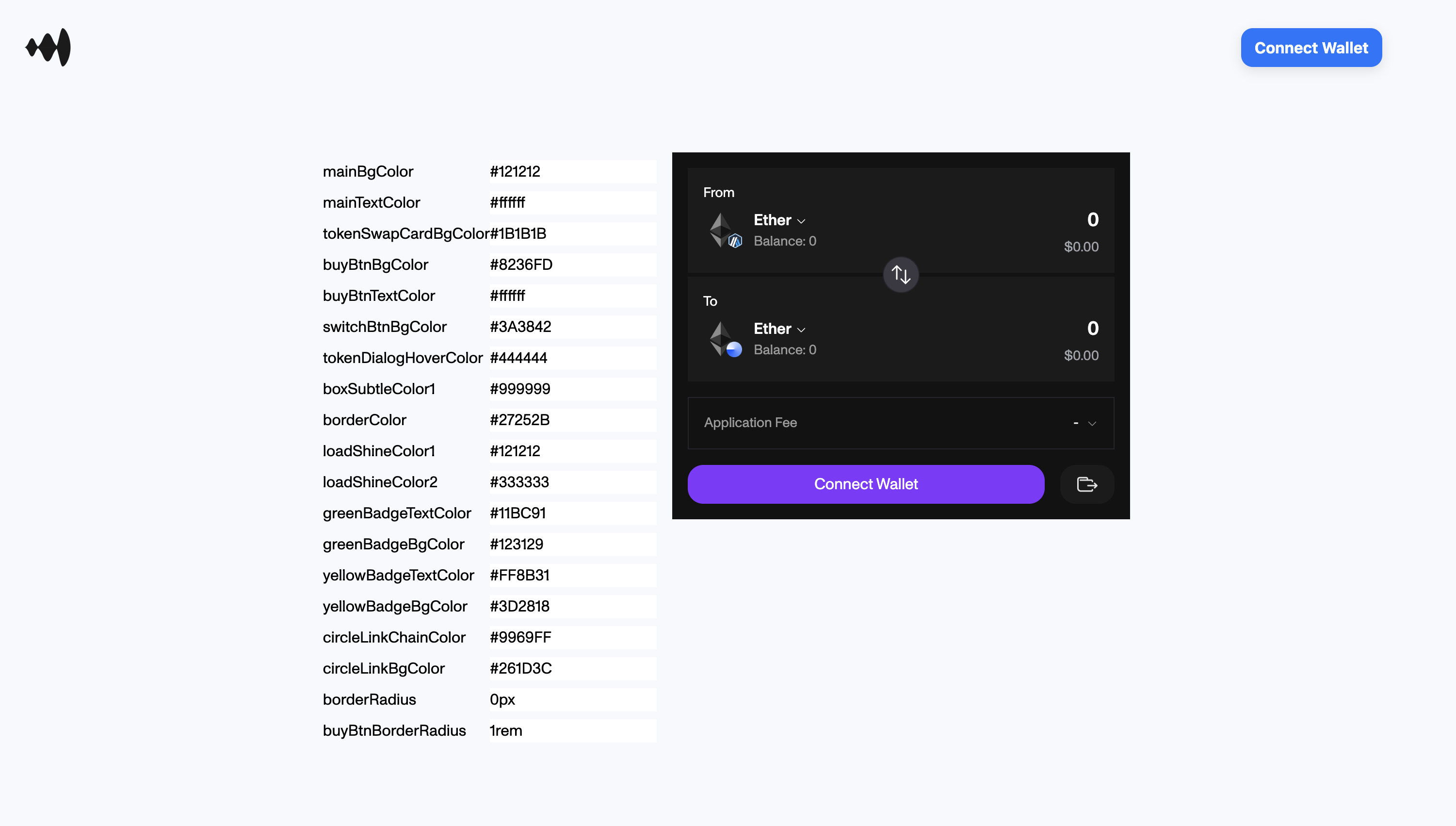
Many teams have successfully tailored the modal to their application, select examples highlighted below:
Dora

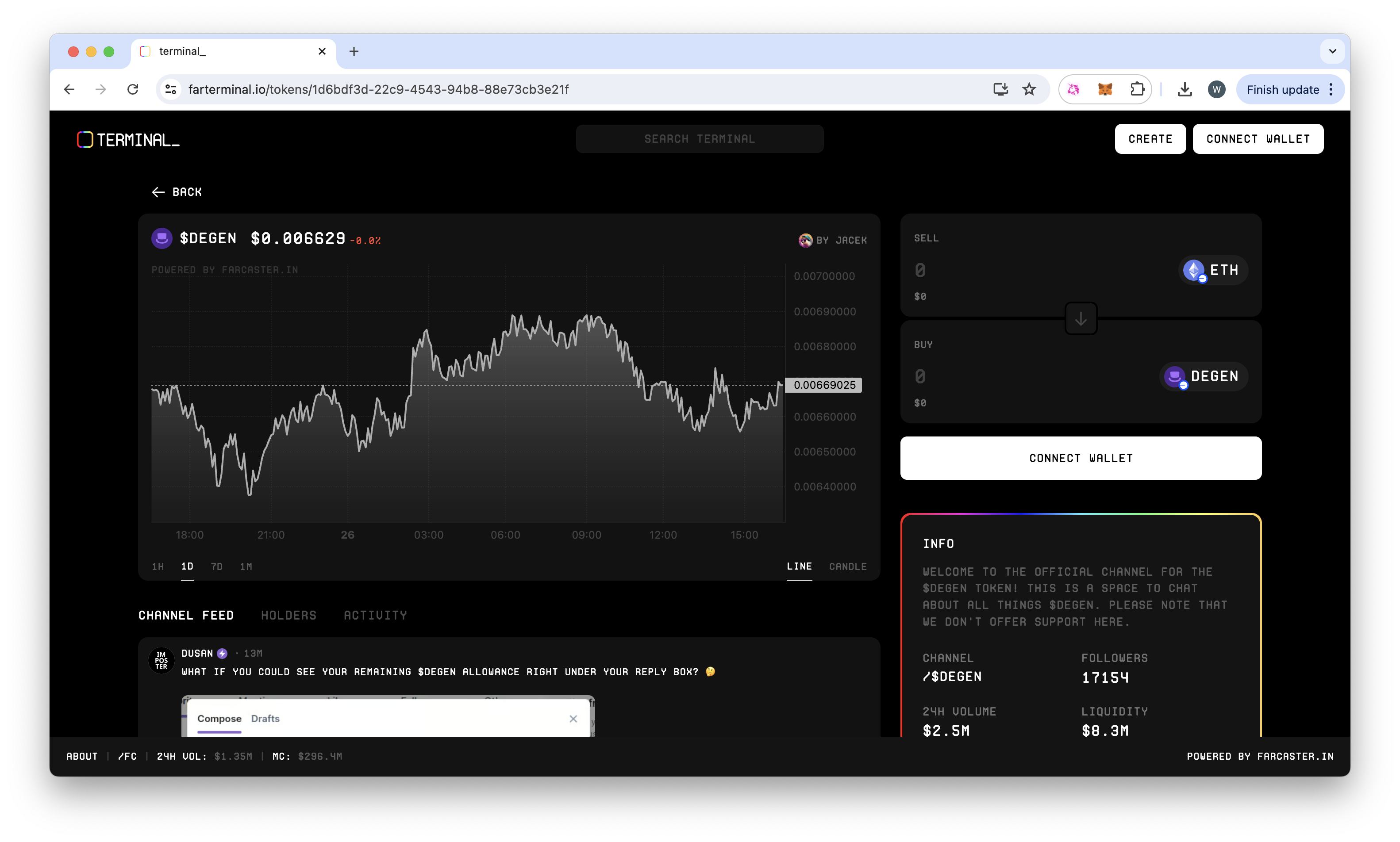
Farterminal
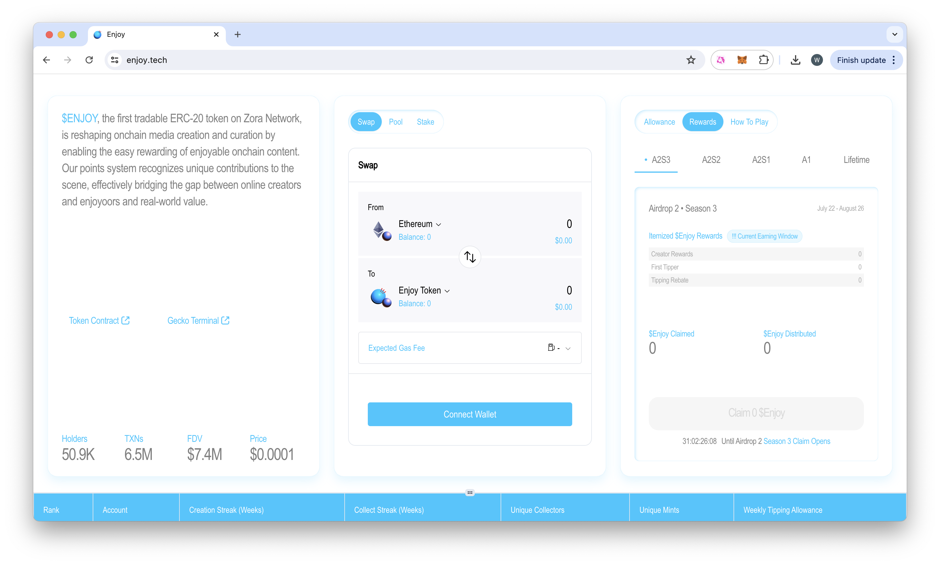
Enjoy
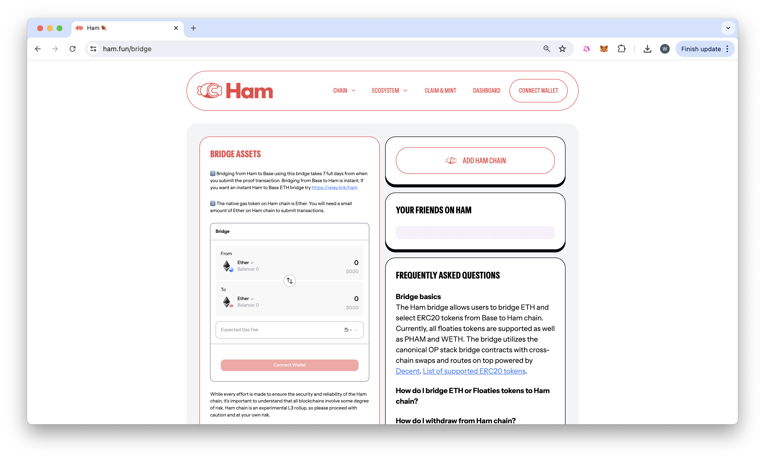
Ham